Consider your letters - why choosing the right brand typography matters
While many people think creating a brand is just logo design, it is in fact much more than that. It is colours, tone of voice, product quality and purpose.
In fact, it’s every interaction one has with a company. One element that could be easy to overlook, but has a big impact, is the brand font or typeface.
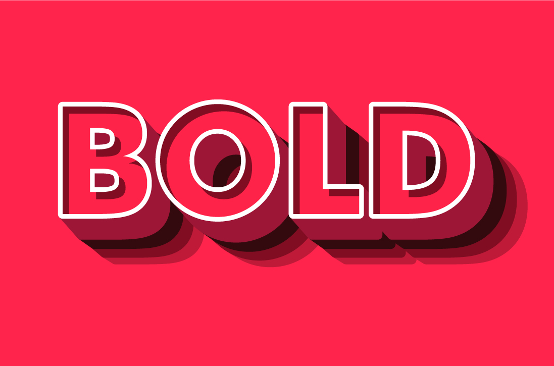
This choice can say a lot about your brand values. Are you modern or traditional? Bold or reserved? Get the typeface wrong and you could subconsciously alienate your audience. But fear not, we’re here to help with our guide to choosing the correct font for your brand.
What is a typeface?
First things first, it’s important to determine what we mean by a brand typeface. Although the terms typeface and font are similar, there are historic differences between the two. In fact, a typeface comprises different fonts.
Specifically, font refers to a particular weight and style of a typeface.
So, if your chosen typeface is Roboto, then the 12 point Roboto and 14 point Roboto would be different fonts.
Likewise, Roboto Light, Roboto Bold and Roboto Black are different fonts within the Roboto typeface family.
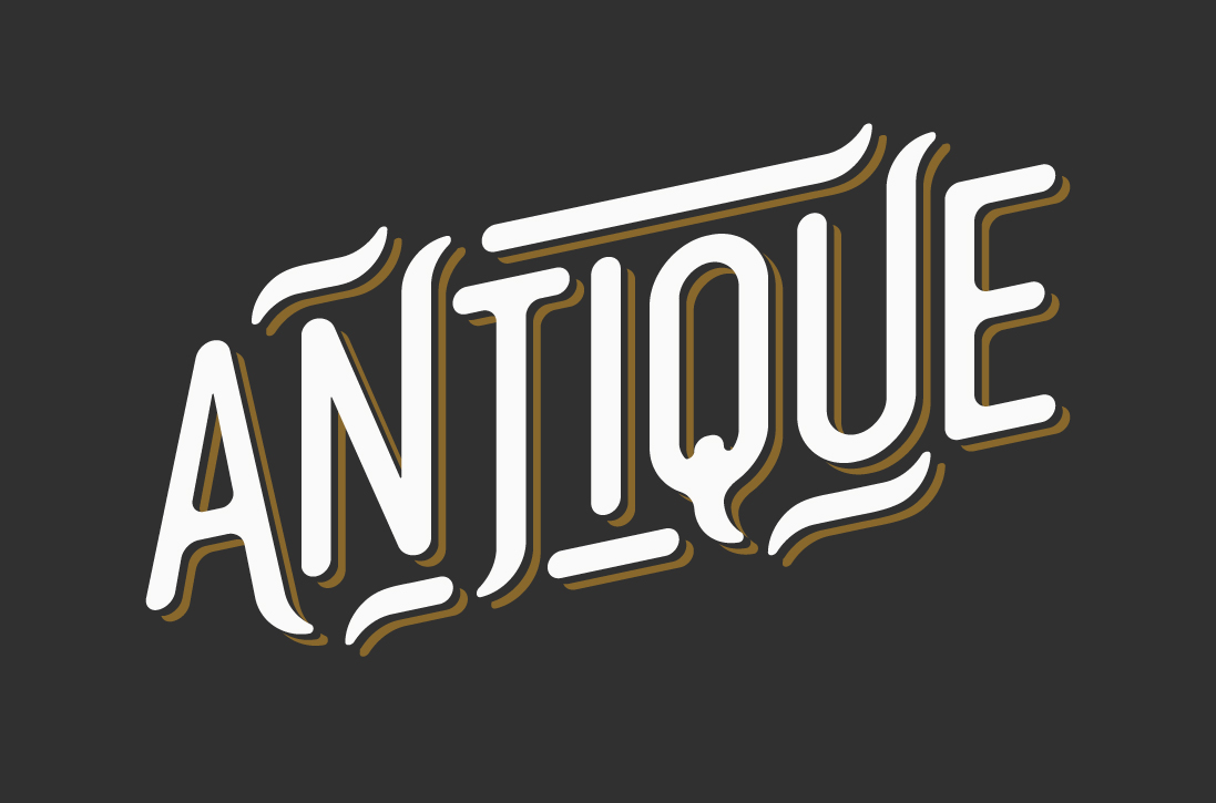
Typefaces historically fall into 14 different categories of style, including humanist, geometric and blackletter. Each encompasses both stylistic and cultural references, which need to be considered in the context of your brand.
Indeed, with thousands of typefaces instantly downloadable to us, choosing a typeface can seem like a rather daunting task.
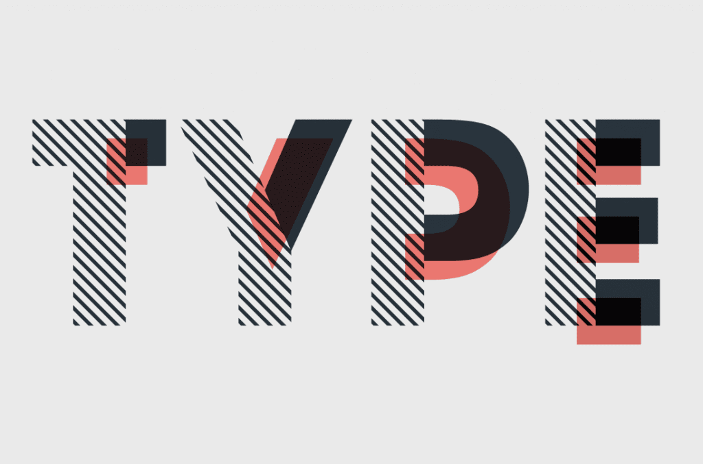
What’s the difference between a serif and a sans serif font?
In this article, we discuss the merits of serif and sans serif typefaces. So what do these terms mean?
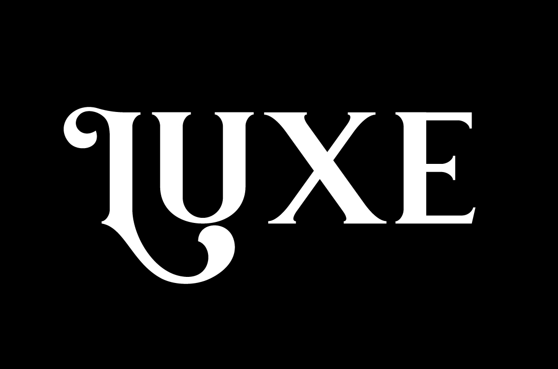
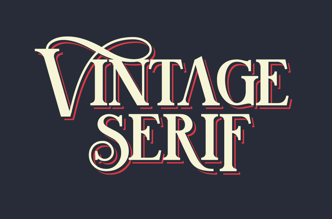
Serif – a serif font is one with a broadening triangular form or line on the terminals of the letters. Often used in extensive areas of text such as books and magazines, we associate serif fonts with tradition and trustworthiness. Popular examples of serif fonts include Times New Roman, Garamond and Georgia.
Sans serif – sans serif fonts don’t have these additions to the terminals. Because of their clean lines, they are ideal for use on digital screens. Modern and friendly, examples of serif fonts include Arial, Helvetica and Calibri.
What to consider when choosing a brand typeface for body text
For editorial pieces, with large bodies of continuous text, there are certain qualities that your chosen typeface should embody.
These considerations include purpose, extent and functionality, legibility and readability, and whether you will use it in print or digital media.
We’ll explore these in more detail below…
Purpose
Typefaces imply meaning; some are hard and cold, some open and friendly, some calligraphic, and some remind us of cultural aspects such as digital displays or propaganda posters. The visual meaning of a typeface should be in sync with the linguistic meaning of the words. For example, Pride and Prejudice is likely to use a classic script font on the cover, rather than a blackletter or slab serif.
Extent and functionality
If you will require a lot of numerals, italics, fractions or Greek letters then you need to find a font that accounts for these. Similarly, if your company name or tagline uses an ‘I’ or an ‘L’, for example, you probably want to use a font that clearly differentiates between ‘I’s and ‘L’s.
Legibility and readability
Legibility is the ability for the reader to recognise and differentiate between characters of a font. Readability is the ease with which your audience can read these characters. As serif-fonts are more distinctive between their characters, they are the favoured choice for immersive reading and large bodies of continuous text such as novels.
Print or digital?
When your editorial piece is to be used on both print and digital mediums, then the selected font will need to be web safe. If you are uploading a digital pdf rather than creating a webpage this is not a problem.
However, if you intend to use these fonts online, select a web-safe font to ensure your reader can view the editorial as intended. If you are considering digital collateral, such as adverts, alongside your editorial, also consider that fonts with subtle curves and details may not rescale well for small digital use.
How to choose a brand font
Start with one brand font
So with these considerations in mind, it’s time to choose your brand typeface.
First, we recommend beginning with one good typeface or family which has all your required components. Consider the weights of the font. You will need at least four weights to aid differentiation and hierarchy within your text.
You can use different weights within a body of text to highlight key points, but they also aid differentiation for titles, subheadings, references, call outs and quotes.
You can often achieve this within one typeface family, or you may decide to use a secondary font for your titles or callouts to compliment the first. Also, consider the relationship between the weights; older fonts were often created in a single weight, with the consequent weights added much later. This can lead to inconsistencies when the weights are used together, for example, within body copy.
Test your chosen fonts
To truly judge a typeface, it needs to be placed in context. For continuous text, this should be a sentence or paragraph at 10-12pt. Then you can judge the evenness of colour and the contrast of text to space. If the counter height is too wide or too high, a paragraph’s form can become too light or too dark, respectively.
Excess ornament can also create a messy or fragmented visual. Characteristics like this work well for display fonts, but not at smaller sizes in large bodies of text.
When you’ve found a font that works in your chosen media, and represents your brand values, you’re pretty much good to go.